
Chapter 2: Visualizing and modelling spatial data
Tomas Beuzen, 2021

Chapter Learning Objectives
Make informed choices about how to plot your spatial data, e.g., scattered, polygons, 3D, etc..
Plot spatial data using libraries such as
geopandas,plotly, andkeplergl.Interpolate unobserved spatial data using deterministic methods such as nearest-neighbour interpolation.
Interpolate data from one set of polygons to a different set of polygons using areal interpolation.
Imports
import warnings
import keplergl
import numpy as np
import osmnx as ox
import pandas as pd
import geopandas as gpd
import plotly.express as px
from skgstat import Variogram
import matplotlib.pyplot as plt
from shapely.geometry import Point
from pykrige.ok import OrdinaryKriging
from scipy.interpolate import NearestNDInterpolator
from tobler.area_weighted import area_interpolate
# Custom functions
from scripts.utils import pixel2poly
# Plotting defaults
plt.style.use('ggplot')
px.defaults.height = 400; px.defaults.width = 620
plt.rcParams.update({'font.size': 16, 'axes.labelweight': 'bold', 'figure.figsize': (6, 6), 'axes.grid': False})
1. Spatial visualization
1.1. Geopandas
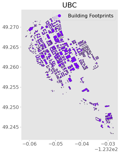
We saw last chapter how to easily plot geospatial data using the geopandas method .plot(). This workflow is useful for making quick plots, exploring your data, and easily layering geometries. Let’s import some data of UBC buildings using osmnx (our Python API for accessing OpenStreetMap data) and make a quick plot:
ubc = (ox.geometries_from_place("University of British Columbia, Canada", tags={'building':True})
.loc[:, ["geometry"]] # just keep the geometry column for now
.query("geometry.type == 'Polygon'") # only what polygons (buidling footprints)
.assign(Label="Building Footprints") # assign a label for later use
.reset_index(drop=True) # reset to 0 integer indexing
)
ubc.head()
| geometry | Label | |
|---|---|---|
| 0 | POLYGON ((-123.25526 49.26695, -123.25506 49.2... | Building Footprints |
| 1 | POLYGON ((-123.25328 49.26803, -123.25335 49.2... | Building Footprints |
| 2 | POLYGON ((-123.25531 49.26859, -123.25493 49.2... | Building Footprints |
| 3 | POLYGON ((-123.25403 49.26846, -123.25408 49.2... | Building Footprints |
| 4 | POLYGON ((-123.25455 49.26906, -123.25398 49.2... | Building Footprints |
Recall that we can make a plot using the .plot() method on a GeoDataFrame:
ax = ubc.plot(figsize=(8, 8), column="Label", legend=True,
edgecolor="0.2", markersize=200, cmap="rainbow")
plt.title("UBC");
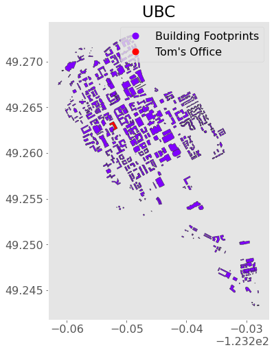
Say I know the “point” location of my office but I want to locate the building footprint (a “polygon”). That’s easily done with geopandas!
First, I’ll use shapely (the Python geometry library geopandas is built on) to make my office point, but you could also use the geopandas function gpd.points_from_xy() like we did last chapter:
point_office = Point(-123.2522145, 49.2629555)
point_office

Now, I can use the .contains() method to find out which building footprint my office resides in:
ubc[ubc.contains(point_office)]
| geometry | Label | |
|---|---|---|
| 48 | POLYGON ((-123.25217 49.26345, -123.25196 49.2... | Building Footprints |
Looks like it’s index 48! I’m going to change the label of that one to “Tom’s Office”:
ubc.loc[48, "Label"] = "Tom's Office"
Now let’s make a plot!
ax = ubc.plot(figsize=(8, 8), column="Label", legend=True,
edgecolor="0.2", markersize=200, cmap="rainbow")
plt.title("UBC");
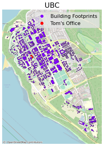
We can add more detail to this map by including a background map. For this, we need to install the contextily package. Note that most web providers use the Web Mercator projection, “EPSG:3857” (interesting article on that here) so I’ll convert to that before plotting:
import contextily as ctx
ax = (ubc.to_crs("EPSG:3857")
.plot(figsize=(10, 8), column="Label", legend=True,
edgecolor="0.2", markersize=200, cmap="rainbow")
)
ctx.add_basemap(ax, source=ctx.providers.OpenStreetMap.Mapnik) # I'm using OSM as the source. See all provides with ctx.providers
plt.axis("off")
plt.title("UBC");
1.2. Plotly
The above map is nice, but it sure would be helpful in some cases to have interactive functionality for our map don’t you think? Like the ability to zoom and pan? Well there are several packages out there that can help us with that, but plotly is one of the best for this kind of mapping. plotly supports plotting of maps backed by MapBox (a mapping and location data cloud platform).
Here’s an example using the plotly.express function px.choropleth_mapbox():
fig = px.choropleth_mapbox(ubc, geojson=ubc.geometry, locations=ubc.index, color="Label",
center={"lat": 49.261, "lon": -123.246}, zoom=12.5,
mapbox_style="open-street-map")
fig.update_layout(margin=dict(l=0, r=0, t=30, b=10))
You can pan and zoom above as you desire! How about we add a terrain map instead:
fig = px.choropleth_mapbox(ubc, geojson=ubc.geometry, locations=ubc.index, color="Label",
center={"lat": 49.261, "lon": -123.246}, zoom=12.5,
mapbox_style="stamen-terrain")
fig.update_layout(margin=dict(l=0, r=0, t=30, b=10))
We are just colouring our geometries based on a label at the moment, but we could of course do some cooler things. Let’s colour by building area:
# Calculate area
ubc["Area"] = ubc.to_crs(epsg=3347).area # note I'm projecting to EPSG:3347 (the projected system in meters that Statistics Canada useshttps://epsg.io/3347)
# Make plot
fig = px.choropleth_mapbox(ubc, geojson=ubc.geometry, locations=ubc.index, color="Area",
center={"lat": 49.261, "lon": -123.246}, zoom=12.5,
mapbox_style="carto-positron")
fig.update_layout(margin=dict(l=0, r=0, t=30, b=10))
Check out the plotly documentation for more - there are many plotting options and examples to learn from! Other popular map plotting options include altair (doesn’t support interactivity yet), folium, and bokeh.
1.3. Kepler.gl
The above mapping was pretty cool, but are you ready for more power?

Time to introduce kepler.gl! keplergl is a web-based tool for visualing spatial data. Luckily, it has a nice Python API and Jupyter extension for us to use (see the install instructions). The basic way keplergl works is:
We create an instance of a map with
keplergl.KeplerGl()We add as much data to the map as we like with the
.add_data()methodWe customize and configure the map in any way we like using the GUI (graphical user interface)
ubc_map = keplergl.KeplerGl(height=500)
ubc_map.add_data(data=ubc.copy(), name="Building heights")
ubc_map
User Guide: https://docs.kepler.gl/docs/keplergl-jupyter
%%html
<iframe src="../_images/ubc-2d.html" width="80%" height="500"></iframe>
I’ll do you one better than that! Let’s add a 3D element to our plot! I’m going to load in some data of UBC building heights I downloaded from the City of Vancouver Open Data Portal:
ubc_bldg_heights = gpd.read_file("data-spatial/ubc-building-footprints-2009")
ubc_bldg_heights.head()
| id | orient8 | bldgid | topelev_m | med_slope | baseelev_m | hgt_agl | rooftype | area_m2 | avght_m | minht_m | maxht_m | base_m | len | wid | geometry | |
|---|---|---|---|---|---|---|---|---|---|---|---|---|---|---|---|---|
| 0 | 158502.0 | 26.7542 | 112433.0 | 97.55 | 4.0 | 80.01 | 17.54 | Flat | 2085.07 | 13.70 | 0.00 | 21.76 | 81.40 | 110.61 | 41.11 | POLYGON ((-123.25550 49.26127, -123.25544 49.2... |
| 1 | 158503.0 | 26.7542 | 112433.0 | 100.58 | 13.0 | 81.50 | 19.08 | Flat | 2085.07 | 13.70 | 0.00 | 21.76 | 81.40 | 110.61 | 41.11 | POLYGON ((-123.25561 49.26111, -123.25578 49.2... |
| 2 | 158506.0 | 27.5790 | 112852.0 | 122.32 | 5.0 | 93.04 | 29.28 | Flat | 4116.37 | 18.02 | 0.03 | 30.55 | 93.73 | 67.22 | 66.37 | POLYGON ((-123.24859 49.26136, -123.24850 49.2... |
| 3 | 158508.0 | 28.2727 | 120767.0 | 109.85 | 1.0 | 90.51 | 19.33 | Flat | 5667.17 | 17.95 | 0.17 | 31.16 | 89.19 | 155.53 | 59.50 | POLYGON ((-123.25340 49.26482, -123.25351 49.2... |
| 4 | 158509.0 | 28.5496 | 122507.0 | 112.69 | 27.0 | 86.63 | 26.07 | Pitched | 1349.35 | 18.26 | 0.00 | 27.34 | 87.79 | 64.92 | 26.47 | POLYGON ((-123.25520 49.26655, -123.25524 49.2... |
I’m going to combine this with our ubc data and do a bit of clean-up and wrangling. You’ll do this workflow in your lab too so I won’t spend too much time here:
ubc_bldg_heights = (gpd.sjoin(ubc, ubc_bldg_heights[["hgt_agl", "geometry"]], how="inner")
.drop(columns="index_right")
.rename(columns={"hgt_agl": "Height"})
.reset_index()
.dissolve(by="index", aggfunc="mean") # dissolve is like "groupby" in pandas. We use it because it retains geometry information
)
Now I’ll make a new map and configure it to be in 3D using the GUI!
ubc_height_map = keplergl.KeplerGl(height=500)
ubc_height_map.add_data(data=ubc_bldg_heights.copy(), name="Building heights")
ubc_height_map
User Guide: https://docs.kepler.gl/docs/keplergl-jupyter
%%html
<iframe src="../_images/ubc-3d.html" width="80%" height="500"></iframe>
You can save your configuration and customization for re-use later (see the docs here)
2. Spatial modelling
There’s typically two main ways we might want to “model” spatial data:
Spatial interpolation: use a set of observations in space to estimate the value of a spatial field
Areal interpolation: project data from one set of polygons to another set of polygons
Both are based on the fundamental premise: “everything is related to everything else, but near things are more related than distant things.” (Tobler’s first law of geography). To demonstrate some of these methods, we’ll look at the annual average air pollution (PM 2.5) recorded at stations across BC during 2020 (which I downloaded from DataBC):
pm25 = pd.read_csv("data/bc-pm25.csv")
pm25.head()
| Station Name | Lat | Lon | EMS ID | PM_25 | |
|---|---|---|---|---|---|
| 0 | Abbotsford A Columbia Street | 49.021500 | -122.326600 | E289309 | 4.7 |
| 1 | Abbotsford Central | 49.042800 | -122.309700 | E238212 | 4.6 |
| 2 | Agassiz Municipal Hall | 49.238032 | -121.762334 | E293810 | 6.7 |
| 3 | Burnaby South | 49.215300 | -122.985600 | E207418 | 3.8 |
| 4 | Burns Lake Fire Centre | 54.230700 | -125.764300 | E225267 | 5.4 |
fig = px.scatter_mapbox(pm25, lat="Lat", lon="Lon", color="PM_25", size="PM_25",
color_continuous_scale="RdYlGn_r",
center={"lat": 52.261, "lon": -123.246}, zoom=3.5,
mapbox_style="carto-positron", hover_name="Station Name")
fig.update_layout(margin=dict(l=0, r=0, t=30, b=10))
fig.show()
The goal is to interpolate these point measurements to estimate the air pollution for all of BC.
2.1. Deterministic spatial interpolation
Create surfaces directly from measured points using a mathematical function. Common techniques (all available in the scipy module interpolate) are:
Inverse distance weighted interpolation
Nearest neighbour interpolation
Polynomial interpolation
Radial basis function (RBF) interpolation
Let’s try nearest neighbour interpolation now using scipy.interpolate.NearestNDInterpolator. As angular coordinates (lat/lon) are not good for measuring distances, I’m going to first convert my data to the linear, meter-based Lambert projection recommend by Statistics Canada and extract the x and y locations as columns in my GeoDataFrame (“Easting” and “Northing” respectively):
gpm25 = (gpd.GeoDataFrame(pm25, crs="EPSG:4326", geometry=gpd.points_from_xy(pm25["Lon"], pm25["Lat"]))
.to_crs("EPSG:3347")
)
gpm25["Easting"], gpm25["Northing"] = gpm25.geometry.x, gpm25.geometry.y
gpm25.head()
| Station Name | Lat | Lon | EMS ID | PM_25 | geometry | Easting | Northing | |
|---|---|---|---|---|---|---|---|---|
| 0 | Abbotsford A Columbia Street | 49.021500 | -122.326600 | E289309 | 4.7 | POINT (4056511.036 1954658.126) | 4.056511e+06 | 1.954658e+06 |
| 1 | Abbotsford Central | 49.042800 | -122.309700 | E238212 | 4.6 | POINT (4058698.814 1956191.109) | 4.058699e+06 | 1.956191e+06 |
| 2 | Agassiz Municipal Hall | 49.238032 | -121.762334 | E293810 | 6.7 | POINT (4104120.445 1957264.772) | 4.104120e+06 | 1.957265e+06 |
| 3 | Burnaby South | 49.215300 | -122.985600 | E207418 | 3.8 | POINT (4023977.036 1996103.398) | 4.023977e+06 | 1.996103e+06 |
| 4 | Burns Lake Fire Centre | 54.230700 | -125.764300 | E225267 | 5.4 | POINT (4128403.079 2571148.393) | 4.128403e+06 | 2.571148e+06 |
Now let’s create a grid of values (a raster) to interpolate over. I’m just going to make a square grid of fixed resolution that spans the bounds of my observed data points (we’ll plot this shortly so you can see what it looks like):
resolution = 25_000 # cell size in meters
gridx = np.arange(gpm25.bounds.minx.min(), gpm25.bounds.maxx.max(), resolution)
gridy = np.arange(gpm25.bounds.miny.min(), gpm25.bounds.maxy.max(), resolution)
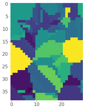
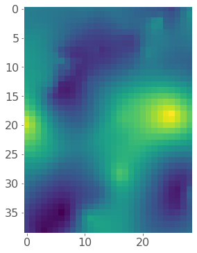
So now let’s interpolate using a nearest neighbour method (the code below is straight from the scipy docs):
model = NearestNDInterpolator(x = list(zip(gpm25["Easting"], gpm25["Northing"])),
y = gpm25["PM_25"])
z = model(*np.meshgrid(gridx, gridy))
plt.imshow(z);
Okay so it looks like we successfully interpolated our made-up grid, but let’s re-project it back to our original map. To do this I need to convert each cell in my raster to a small polygon using a simple function I wrote called pixel2poly() which we imported at the beginning of the notebook:
polygons, values = pixel2poly(gridx, gridy, z, resolution)
Now we can convert that to a GeoDataFrame and plot using plotly:
pm25_model = (gpd.GeoDataFrame({"PM_25_modelled": values}, geometry=polygons, crs="EPSG:3347")
.to_crs("EPSG:4326")
)
fig = px.choropleth_mapbox(pm25_model, geojson=pm25_model.geometry, locations=pm25_model.index,
color="PM_25_modelled", color_continuous_scale="RdYlGn_r", opacity=0.5,
center={"lat": 52.261, "lon": -123.246}, zoom=3.5,
mapbox_style="carto-positron")
fig.update_layout(margin=dict(l=0, r=0, t=30, b=10))
fig.update_traces(marker_line_width=0)
Very neat! Also, notice how the grid distorts a bit once we project it back onto an angular (degrees-based) projection from our linear (meter-based) projection.
2.2. Probabilistic (geostatistical) spatial interpolation
Geostatistical interpolation (called “Kriging”) differs to deterministic interpolation in that we interpolate using statistical models that include estimates of spatial autocorrelation. There’s a lot to read about kriging, I just want you to be aware of the concept in case you need to do something like this in the future. Usually I’d do this kind of interpolation in GIS software like ArcGIS or QGIS, but it’s possible to do in Python too.
The basic idea is that if we have a set of observations \(Z(s)\) at locations \(s\), we estimate the value of an unobserved location (\(s_0\)) as a weighted sum: $\(\hat{Z}(s_0)=\sum_{i=0}^{N}\lambda_iZ(s_i)\)$
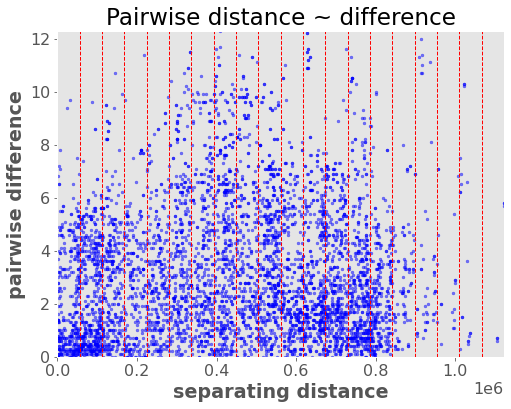
Where \(N\) is the size of \(s\) (number of observed samples) and \(\lambda\) is an array of weights. The key is deciding which weights \(\lambda\) to use. Kriging uses the spatial autocorrelation in the data to determine the weights. Spatial autocorrelation is calculated by looking at the squared difference (the variance) between points at similar distances apart, let’s see what that means:
warnings.filterwarnings("ignore") # Silence some warnings
vario = Variogram(coordinates=gpm25[["Easting", "Northing"]],
values=gpm25["PM_25"],
n_lags=20)
vario.distance_difference_plot();
The idea is to then fit a model to this data that describes how variance (spatial autocorrelation) changes with distance (“lag”) between locations. We look at the average variance in bins of the above distances/pairs and fit a line through them. This model is called a “variogram” and it’s analogous to the autocorrelation function for time series. It defines the variance (autocorrelation structure) as a function of distance:
vario.plot(hist=False);
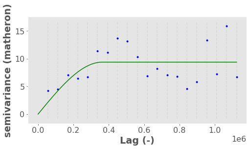
The above plot basically shows that:
at small distances (points are close together), variance is reduced because points are correlated
but at a distance around 400,000 m the variance flattens out indicating points are two far away to have any impactful spatial autocorrelation. This location is called the “range” while the variance at the “range” is called the “sill” (like a ceiling). We can extract the exact range:
vario.describe()["effective_range"]
363018.90908542706
By the way, we call it the semi-variance because there is a factor of 0.5 in the equation to account for the fact that variance is calculated twice for each pair of points (read more here).
Remember, our variogram defines the spatial autocorrelation of the data (i.e., how the locations in our region affect one another). Once we have a variogram model, we can use it to estimate the weights in our kriging model. I won’t go into detail on how this is done, but there is a neat walkthrough in the scikit-gstat docs here.
Anyway, I’ll briefly use the pykrige library to do some kriging so you can get an idea of what it looks like:
krig = OrdinaryKriging(x=gpm25["Easting"], y=gpm25["Northing"], z=gpm25["PM_25"], variogram_model="spherical")
z, ss = krig.execute("grid", gridx, gridy)
plt.imshow(z);
Now let’s convert our raster back to polygons so we can map it. I’m also going to load in a polygon of BC using osmnx to clip my data so it fits nicely on my map this time:
polygons, values = pixel2poly(gridx, gridy, z, resolution)
pm25_model = (gpd.GeoDataFrame({"PM_25_modelled": values}, geometry=polygons, crs="EPSG:3347")
.to_crs("EPSG:4326")
)
bc = ox.geocode_to_gdf("British Columbia, Canada")
pm25_model = gpd.clip(pm25_model, bc)
fig = px.choropleth_mapbox(pm25_model, geojson=pm25_model.geometry, locations=pm25_model.index,
color="PM_25_modelled", color_continuous_scale="RdYlGn_r",
center={"lat": 52.261, "lon": -123.246}, zoom=3.5,
mapbox_style="carto-positron")
fig.update_layout(margin=dict(l=0, r=0, t=30, b=10))
fig.update_traces(marker_line_width=0)
I used an “ordinary kriging” interpolation above which is the simplest implementation of kriging. The are many other forms of kriging too that can account for underlying trends in the data (“universal kriging”), or even use a regression or classification model to make use of additional explanatory variables. pykrige supports most variations. In particular for the latter, pykrige can accept sklearn models which is useful!
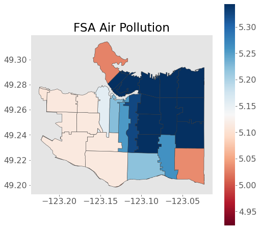
2.3. Areal interpolation
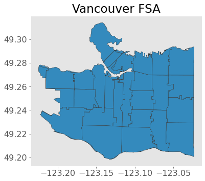
Areal interpolation is concerned with mapping data from one polygonal representation to another. Imagine I want to map the air pollution polygons I just made to FSA polygons (recall FSA is “forward sortation area”, which are groups of postcodes). The most intuitive way to do this is to distribute values based on area proportions, hence “areal interpolation”.
I’ll use the tobler library for this. First, load in the FSA polygons:
van_fsa = gpd.read_file("data-spatial/van-fsa")
ax = van_fsa.plot(edgecolor="0.2")
plt.title("Vancouver FSA");
Now I’m just going to made a higher resolution interpolation using kriging so we can see some of the details on an FSA scale:
resolution = 10_000 # cell size in meters
gridx = np.arange(gpm25.bounds.minx.min(), gpm25.bounds.maxx.max(), resolution)
gridy = np.arange(gpm25.bounds.miny.min(), gpm25.bounds.maxy.max(), resolution)
krig = OrdinaryKriging(x=gpm25["Easting"], y=gpm25["Northing"], z=gpm25["PM_25"], variogram_model="spherical")
z, ss = krig.execute("grid", gridx, gridy)
polygons, values = pixel2poly(gridx, gridy, z, resolution)
pm25_model = (gpd.GeoDataFrame({"PM_25_modelled": values}, geometry=polygons, crs="EPSG:3347")
.to_crs("EPSG:4326")
)
Now we can easily do the areal interpolation using the function area_interpolate():
areal_interp = area_interpolate(pm25_model.to_crs("EPSG:3347"),
van_fsa.to_crs("EPSG:3347"),
intensive_variables=["PM_25_modelled"]).to_crs("EPSG:4326")
areal_interp.plot(column="PM_25_modelled", figsize=(8, 8),
edgecolor="0.2", cmap="RdBu", legend=True)
plt.title("FSA Air Pollution");
There are other methods you can use for areal interpolation too, that include additional variables or use more advanced interpolation algorithms. The tobbler documentation describes some of these.